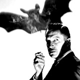
Johnny Cash over here.Mudfuzz wrote:I agree on #2, but then I don't buy shirts that are not black.
Can a dude get some feedback on (new!) merch designs?
Moderator: Ghost Hip
-
Ugly Nora
- IAMILFFAMOUS

- Posts: 3376
- Joined: Sun Jul 14, 2013 4:22 pm
- Location: Shermer, Illinois
Re: Can a dude get some feedback on merch designs?
-
Mudfuzz
- HERO

- Posts: 16705
- Joined: Sat Jul 07, 2007 7:06 pm
- Location: The gloomy lands of the northwest
Re: Can a dude get some feedback on merch designs?
You sound like my bossUgly Nora wrote:Johnny Cash over here.Mudfuzz wrote:I agree on #2, but then I don't buy shirts that are not black.
-
DrMabuse
- committed

- Posts: 102
- Joined: Tue Feb 03, 2015 4:03 am
Re: Can a dude get some feedback on merch designs?
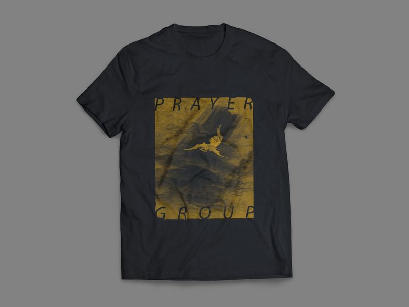
#2 is the one I'd go for as a shirt. The illustration on #1 is great, but the lettering doesn't do it justice. I'd try moving the text a bit so it frames the art rather than running over it. Maybe play with some alternate fonts as well. Impact italic or something a little fancier.Maybe a border of some sort.
If you can't get it to work as a shirt, that illustration as part of a poster could be awesome.
If you can't get it to work as a shirt, that illustration as part of a poster could be awesome.
-
Iommic Pope
- IAMILFFAMOUS
- Posts: 11400
- Joined: Tue Mar 05, 2013 8:41 pm
- Location: Frimmin' on the Fram
Re: Can a dude get some feedback on merch designs?
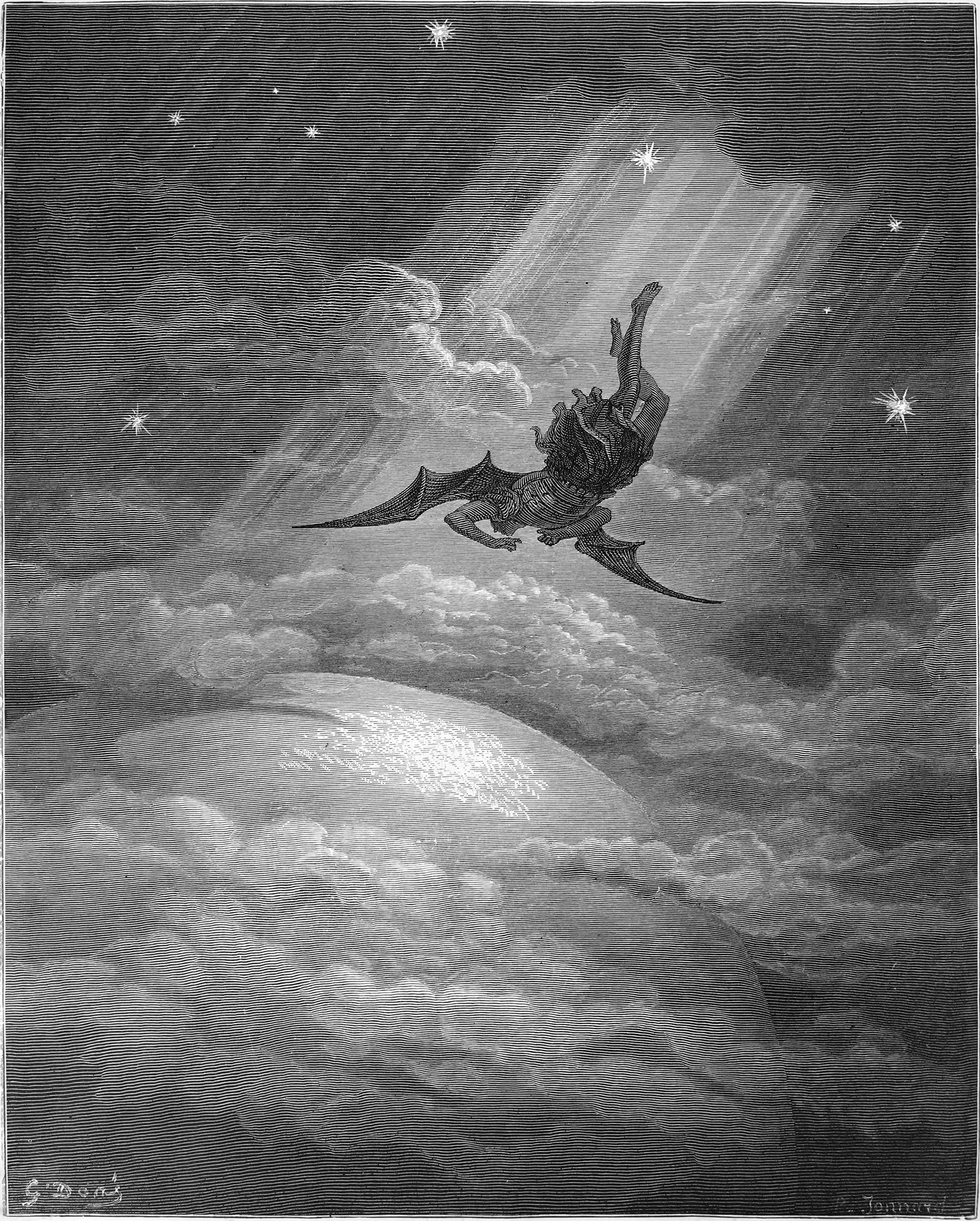
I cannot wear white either (I was cursed by a gypsy, but that's a different story), but I liked the whole 5-legged fawn thang goin on there.
The second was cool, but not simple enough. Remember that a shirt has to make a real quick statement. Mutant mammalia does that more efficiently.
Plus your winged guy looks REAL close to the Sabbath winged guy logo, so that would deter me if I was in your position.
Fonts are the hardest shit ever to get right. Good luck there.
Maybe some simple rune like fonts could work for the implied subversive religious undertones you got goin on with your name and imagery (unless I'm miles off there, in which case apologies)?
Something like this, only legible?
http://savevsdragon.blogspot.com.au/201 ... -font.html

This? http://www.shutterstock.com/s/runic/sea ... =117569284

The second was cool, but not simple enough. Remember that a shirt has to make a real quick statement. Mutant mammalia does that more efficiently.
Plus your winged guy looks REAL close to the Sabbath winged guy logo, so that would deter me if I was in your position.
Fonts are the hardest shit ever to get right. Good luck there.
Maybe some simple rune like fonts could work for the implied subversive religious undertones you got goin on with your name and imagery (unless I'm miles off there, in which case apologies)?
Something like this, only legible?
http://savevsdragon.blogspot.com.au/201 ... -font.html
This? http://www.shutterstock.com/s/runic/sea ... =117569284
WWPD?
fcknoise wrote:You are all fucking tryhard effort posting nerds
Invisible Man wrote: I'm probably the most humble person I know. I feel good about smelling my own butthole.
Jesus Was a Robot wrote:Did you just assume Billy Corgan's dildo preference??
-
deviever
- involved

- Posts: 85
- Joined: Tue Jul 23, 2013 10:42 am
-
D.o.S.
- IAMILFFAMOUS
- Posts: 29881
- Joined: Sun Jul 03, 2011 8:47 am
- Location: Ewe-Kay
Re: Can a dude get some feedback on merch designs?
For anyone that's curious that is "Satan Descends Upon The Earth" by Gustave Dore. It's an illustration to go along with Paradise Lost, and, like almost everything else to do with Paradise Lost, is infinitely more interesting than the text itself:Iommic Pope wrote:Plus your winged guy looks REAL close to the Sabbath winged guy logo, so that would deter me if I was in your position.
http://upload.wikimedia.org/wikipedia/c ... ost_12.jpg
It should also be noted that Dore's scarf game was seriously on point:
http://commons.wikimedia.org/wiki/Gustave_Dor%C3%A9
-
lordgalvar
- Supporter

- Posts: 6165
- Joined: Fri Nov 14, 2014 5:59 pm
- Location: Somewhere between ignore and the OC
Re: Can a dude get some feedback on merch designs?
You are right with both. I've got all the plates for the Divine Comedy. Good stuff.D.o.S. wrote:For anyone that's curious that is "Satan Descends Upon The Earth" by Gustave Dore. It's an illustration to go along with Paradise Lost, and, like almost everything else to do with Paradise Lost, is infinitely more interesting than the text itself:Iommic Pope wrote:Plus your winged guy looks REAL close to the Sabbath winged guy logo, so that would deter me if I was in your position.
http://upload.wikimedia.org/wikipedia/c ... ost_12.jpg
It should also be noted that Dore's scarf game was seriously on point:
http://commons.wikimedia.org/wiki/Gustave_Dor%C3%A9
I think, as others have said, that the font is a problem on the first shirt. White shirts are another thing that are a problem for me (I wasn't cursed by a gypsy but I get the same results). Yea, nothing new.
-Ring Mods!
"I make you chocolate"
"I make you chocolate"
- -comesect69-via-Majin Buu-by-way-of-Dirge/mtl.asm and special consideration from CA Anderton
-
Iommic Pope
- IAMILFFAMOUS
- Posts: 11400
- Joined: Tue Mar 05, 2013 8:41 pm
- Location: Frimmin' on the Fram
Re: Can a dude get some feedback on merch designs?
Ah true. Did not pick that as a Dore.D.o.S. wrote:For anyone that's curious that is "Satan Descends Upon The Earth" by Gustave Dore. It's an illustration to go along with Paradise Lost, and, like almost everything else to do with Paradise Lost, is infinitely more interesting than the text itself:Iommic Pope wrote:Plus your winged guy looks REAL close to the Sabbath winged guy logo, so that would deter me if I was in your position.
http://upload.wikimedia.org/wikipedia/c ... ost_12.jpg
It should also be noted that Dore's scarf game was seriously on point:
http://commons.wikimedia.org/wiki/Gustave_Dor%C3%A9
I just received an edition of the Divine Comedy with his plates but I haven't read it yet. And I've not yet read an edition of Paradise Lost with his work throughout (although I do love Paradise Lost, despite its cumbersome passages).
That is, indeed, some hefty scarf action.
Dapper.
Personally, if we're talking etches, I was always a big fan of Durer's work, as well.
Galvar, I think you're on the right track. Designing this sort of shit is no easy task.
Do you guys have any album themes or artwork you could try and incorporate into a design?
WWPD?
fcknoise wrote:You are all fucking tryhard effort posting nerds
Invisible Man wrote: I'm probably the most humble person I know. I feel good about smelling my own butthole.
Jesus Was a Robot wrote:Did you just assume Billy Corgan's dildo preference??
-
lordgalvar
- Supporter
- Posts: 6165
- Joined: Fri Nov 14, 2014 5:59 pm
- Location: Somewhere between ignore and the OC
Re: Can a dude get some feedback on merch designs?
Etchings? My favorites are by Hogarth. His stuff is freaking awesome. I also really like Piranesi.
I think a font color to match the design could might be worth a try (with a complimentry outline, both related to the art, so it kind of blends and not be so bold). Clash the image with another image and blend them together and create a box to do the band name in like the second image? Convert the art to line art to make it a one color print almost like a woodcut? Do scary writing (like old horror comic book or even psychadelic style) to fill the negative space around the mutant so that it boxes it out?
Honestly, it really isn't that bad. It might look better on something like a yellow or light blue shirt. I think the white is just too stark. It could just be a background color issue. You could also just write the name smaller and center it below like that Melvins shirt or Swans.
I dunno.
-Ring Mods!
"I make you chocolate"
"I make you chocolate"
- -comesect69-via-Majin Buu-by-way-of-Dirge/mtl.asm and special consideration from CA Anderton
-
D.o.S.
- IAMILFFAMOUS
- Posts: 29881
- Joined: Sun Jul 03, 2011 8:47 am
- Location: Ewe-Kay
Re: Can a dude get some feedback on merch designs?
Hogarth is pretty rad, but my etching education is pretty minimal and largely confined to the classics.
-
well... it's green
- committed
- Posts: 103
- Joined: Sat Feb 16, 2013 5:31 am
Re: Can a dude get some feedback on merch designs?
I like the cow.
-
lordgalvar
- Supporter
- Posts: 6165
- Joined: Fri Nov 14, 2014 5:59 pm
- Location: Somewhere between ignore and the OC
Re: Can a dude get some feedback on merch designs?
But Hogarth was 100 years earlier. Haha. I think my love of Horgarth was because a lot of my degree focused on Eighteenth century British lit.
Burne Hogarth was OK too. Tarzan.
Redesigns? Decision?
Burne Hogarth was OK too. Tarzan.
Redesigns? Decision?
-Ring Mods!
"I make you chocolate"
"I make you chocolate"
- -comesect69-via-Majin Buu-by-way-of-Dirge/mtl.asm and special consideration from CA Anderton
-
NDominy

- committed

- Posts: 331
- Joined: Mon Nov 22, 2010 11:36 pm
- Location: VA
Re: Can a dude get some feedback on merch designs?
this feedback rules! We haven't had time to do any redesigns yet but this thread has definitely sparked some new ideas. I can't believe that I hadn't looked back through Melvins art for inspiration and now I'm bumping Houdini on repeat. I think first things first is to get that cow off the white shirt and I really like the idea of putting it against some kind of background. Maybe a pattern? Maybe another image?
Also, I'm also really feeling the red-text-on-black-shirt thing, ala this sweet drive like jehu shirt:

I'm really not feeling like changing the Dore design. I definitely agree that it's kind of similar to Sabbath's winged guy, but I'm too too worried about it since we're not using that character as like, a logo or brand kind of thing. I'll post new things as soon as they're done, you all are a great resource!
Also, I'm also really feeling the red-text-on-black-shirt thing, ala this sweet drive like jehu shirt:
I'm really not feeling like changing the Dore design. I definitely agree that it's kind of similar to Sabbath's winged guy, but I'm too too worried about it since we're not using that character as like, a logo or brand kind of thing. I'll post new things as soon as they're done, you all are a great resource!
-
lordgalvar
- Supporter
- Posts: 6165
- Joined: Fri Nov 14, 2014 5:59 pm
- Location: Somewhere between ignore and the OC
Re: Can a dude get some feedback on merch designs?
Are you digital printing or silk screening? That is another thing to take into consideration
I just saw Drive Like Jehu. The house/sound guys shut off the sound at the end of their set.
I just saw Drive Like Jehu. The house/sound guys shut off the sound at the end of their set.
-Ring Mods!
"I make you chocolate"
"I make you chocolate"
- -comesect69-via-Majin Buu-by-way-of-Dirge/mtl.asm and special consideration from CA Anderton
-
daseb
- experienced

- Posts: 720
- Joined: Thu Jun 04, 2015 6:42 am
Re: Can a dude get some feedback on merch designs?
Hiya, I sort of do this thing as a side job for beer money so some constructive ideas if you want?
- First one is great but the font sits weirdly. Maybe bring the top leg of the munted looking animal up over the Y and A in 'prayer'. I also don't like the font but that's a personal thing, I don't vibe with all downloaded fonts as a rule. To give it some life a good trick is to find a font you like, print it out, scrunch up the paper a bit and then re-scan it. You'll distress the letters a bit but in a natural way, and give them a little more life. Also putting each letter in place individually means you can sort of fit them in place to the image which makes the font sit in the whole design better rather than just looking like it's slapped over the top.
- Second one I personally don't like. Images in negative always just look messed up to me unless they're really simple woodblock type designs. But it's more just the idea of getting some Dore and slapping your band name on it that doesn't sit well with me: that was already played out when 80s hardcore bands were doing it. I admit I'm biased because as I said, I like bands to pay me to do this sort of thing, but merch that just has some public domain image that has no connection to your art or what you're doing as band personally says nothing to me. It's not quite as egregious as slapping your name over the black flag bars in a husker du font but it really does come across to me as like 'hey we put no effort into this and it's got nothing to do with our music or what we're about, but hey buy it anyway'.
I'm sorry if that comes across as harsh, I really don't mean it to be. It's just something I feel very strongly about. And the music is great, I feel like the shirt is a total let down compared to that.
I do really, really like way you've inset the font on the image though, that looks awesome.