Your band, other bands, singers, songwriters, more.
Moderator: Ghost Hip
NDominy
committed
Posts: 331Joined: Mon Nov 22, 2010 11:36 pmLocation: VA
Post
by NDominy Sun May 31, 2015 9:10 pm
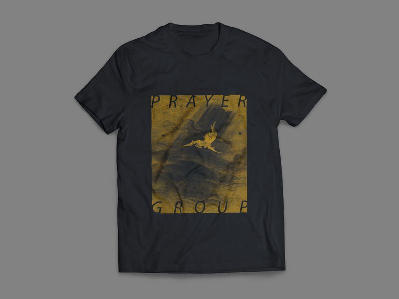
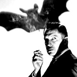
my band is mired in the "too busy (lazy) to get merch made" stage and we seriously need to get out of it. we've been struggling to find an aesthetic that works and we can all agree on, but my ladyfriend and I have come up with these mockups and I've come seeking ILF's venerable opinions. so what do you think- do these designs fit with the tones? would you wear a shirt with a mutant calf on it? has the Dore print been used before? let me know what you think!
soundcloud track is beneath shirts so you can look and listen at the same time, more can be found here:
https://soundcloud.com/prayergroupsaves
Last edited by
NDominy on Wed Jun 17, 2015 6:47 pm, edited 1 time in total.
neonblack
IAMILFFAMOUS
Posts: 8090Joined: Fri Feb 28, 2014 12:00 amLocation: Wilmington, NC
Post
by neonblack Sun May 31, 2015 9:12 pm
I really like the second one! I would wear that like 3 days a week.
NDominy
committed
Posts: 331Joined: Mon Nov 22, 2010 11:36 pmLocation: VA
Post
by NDominy Sun May 31, 2015 9:14 pm
fuck yeah man! I'll let you know when that becomes a possibility
kbit
IAMILFFAMOUS
Posts: 11509Joined: Sun Dec 12, 2010 1:16 pmLocation: Philadelphia
Post
by kbit Mon Jun 01, 2015 12:41 am
Agreed the second shirt is sweet, the first one aint bad but its not a shirt I'd consider buying. It doesnt really grab me beyond the "thats unusual" factor.
D.o.S. wrote: I'm fucking stupid and no one should operate under any other premise.
goroth
HERO
Posts: 13514Joined: Wed Jan 25, 2012 3:50 amLocation: Eurothrash: Frozen northern outpost.
Contact:
Post
by goroth Mon Jun 01, 2015 1:11 am
What kbit said!
D.o.S.
IAMILFFAMOUS
Posts: 29881Joined: Sun Jul 03, 2011 8:47 amLocation: Ewe-Kay
Post
by D.o.S. Mon Jun 01, 2015 1:29 am
I actually really dig the imagery of the first, but I think the layout could be changed. Maybe it's the font that bothers me?
good deals are
here .
flesh couch is
here .
UglyCasanova wrote: It's not the expensive programs you use, it's the way you click and drag.
Achtane wrote: comesect2.0 wrote: Michael Jackson king tut little Richard in your butt.
IT'S THE ENNNND OF THE WORRRLD AS WE KNOW IT
NDominy
committed
Posts: 331Joined: Mon Nov 22, 2010 11:36 pmLocation: VA
Post
by NDominy Mon Jun 01, 2015 11:08 am
thanks for the constructive criticism dudes! I think the first one could definitely be tweaked, I kind of just wanted to try the ol' swans font with a weird image just to see. glad people dig the second one!
BoatRich
IAMILF
Posts: 2374Joined: Wed Mar 26, 2014 2:58 pmLocation: Northern VA/DC
Post
by BoatRich Mon Jun 01, 2015 12:24 pm
The second shirt is fucking rad. The first would be way cooler if it wasn't on plain white. A beige or like taupe color that helps the design blend a little better would look awesome though.
D.o.S.
IAMILFFAMOUS
Posts: 29881Joined: Sun Jul 03, 2011 8:47 amLocation: Ewe-Kay
Post
by D.o.S. Mon Jun 01, 2015 12:29 pm
Also it reminds me way more of the Melvins than Swans. Not in a bad way, just in a way way.
good deals are
here .
flesh couch is
here .
UglyCasanova wrote: It's not the expensive programs you use, it's the way you click and drag.
Achtane wrote: comesect2.0 wrote: Michael Jackson king tut little Richard in your butt.
IT'S THE ENNNND OF THE WORRRLD AS WE KNOW IT
goroth
HERO
Posts: 13514Joined: Wed Jan 25, 2012 3:50 amLocation: Eurothrash: Frozen northern outpost.
Contact:
Post
by goroth Mon Jun 01, 2015 2:15 pm
D.o.S. wrote: I actually really dig the imagery of the first, but I think the layout could be changed. Maybe it's the font that bothers me?
Me too. I think perhaps the text overlaying the image makes it look cluttered.
resincum
Supporter
Posts: 3883Joined: Fri Oct 24, 2014 12:30 amLocation: el paso
Post
by resincum Mon Jun 01, 2015 2:33 pm
D.o.S. wrote: I actually really dig the imagery of the first, but I think the layout could be changed. Maybe it's the font that bothers me?.
wOrd, both are dope!
i'm glad i can call you a friend. even if i'll never see you again
NDominy
committed
Posts: 331Joined: Mon Nov 22, 2010 11:36 pmLocation: VA
Post
by NDominy Mon Jun 01, 2015 6:16 pm
Also it reminds me way more of the Melvins than Swans. Not in a bad way, just in a way way.
I totally see that and it gives me ideas. maybe it's the whole mutant animal thing?
D.o.S.
IAMILFFAMOUS
Posts: 29881Joined: Sun Jul 03, 2011 8:47 amLocation: Ewe-Kay
Post
by D.o.S. Mon Jun 01, 2015 6:19 pm
WAH I have never seen that graphic on a white shirt. Weird. Weird Weird.
good deals are
here .
flesh couch is
here .
UglyCasanova wrote: It's not the expensive programs you use, it's the way you click and drag.
Achtane wrote: comesect2.0 wrote: Michael Jackson king tut little Richard in your butt.
IT'S THE ENNNND OF THE WORRRLD AS WE KNOW IT
Ugly Nora
IAMILFFAMOUS
Posts: 3376Joined: Sun Jul 14, 2013 4:22 pmLocation: Shermer, Illinois
Post
by Ugly Nora Mon Jun 01, 2015 8:03 pm
I wouldn't buy another white t-shirt because history has shown that I always spill food on it the first time I wear it. Just something to keep in mind.
Mudfuzz
HERO
Posts: 16705Joined: Sat Jul 07, 2007 7:06 pmLocation: The gloomy lands of the northwest
Post
by Mudfuzz Mon Jun 01, 2015 8:24 pm
I agree on #2, but then I don't buy shirts that are not black.