I hate the line weight. I hate the fonts. I hate the way the positive and negative space interacts. Every Digitech design just looks and feels so unbalanced. And why the fuck do they put those stupid decorative screws on the face? It's not a lid.
Actually it is a lid, those screws hold the whole top plate on!
I don't understand why they want to mimic an upside-down enclosure with non-fucntional hardware. It's like fake drawers for a kitchen cabinet---completely superfluous, quasi-industrial bedazzling.
No, it mimics the Allen screws on the Whammy and the majority of our rack devices. Since this is a part of the Whammy Family, it is a design call-back to those earlier designs and products.
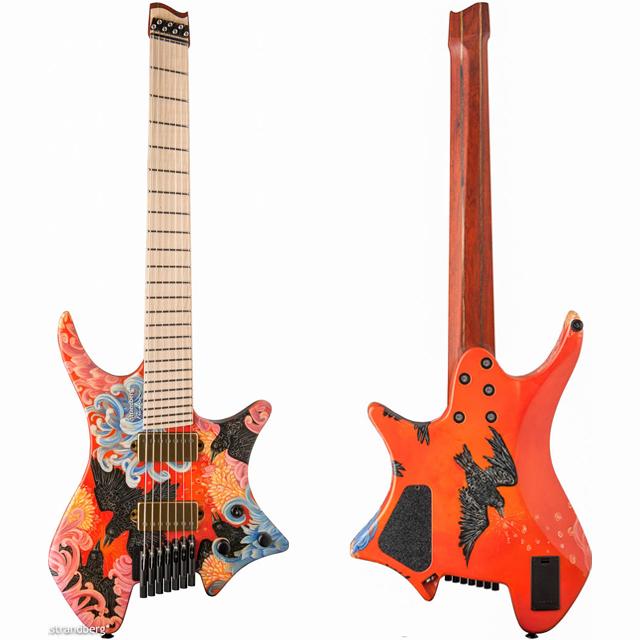
BitchPudding wrote:Strandbergs fit this category pretty well. That said, they do have a certain elegance about them. And they look hella nice when they get custom paint jobs.
Not sure if I'd ever rock one personally, but I would love to try one.
That's a no for me
I can't stand that paintjob, but they are designed in my hometown. Ola didn't have any lefties for me to check out, but they are the most perfectly balanced guitar I've ever used (albeit right handed, so everything felt a little kooky). The curve works so that you can play it traditional electric guitar style, but also flamenco style if that's your jam (with the lower curve on the back side of the guitar). The no headstock thing and where the bridge are also perfectly balanced. If you have a chance to pick one up (like literally, lift the thing, not as in purchase) and put it on, do so. I fucking hate a lot of guitars that have been fanboi'd by the Periphery kidz, but I'm completely sold on the Strandbergs. There are a couple in the local music store that have a matt stained finish that look really classy. Well you know. Classy for that kind of shape.
Gone Fission wrote: ↑Thu Oct 24, 2024 2:21 pm
That’s quarter-assed at best.