Page 5 of 8
Re: ILF needs a logo
Posted: Sat Oct 24, 2009 5:01 pm
by Astricii
Thought the Gain heart section might also make a nice button too if anyone wants to go that route. there's a kid in UT that does sets of buttons rather cheap and you can send a few different designs and specify quantities. I'll go to town on it with some oh my vector grungies and see how she fairs

Re: ILF needs a logo
Posted: Sat Oct 24, 2009 5:03 pm
by Mudfuzz
htsamurai wrote:3rd font in rusty grey w/ 1st picture
")
All right. I get to it later tonight for you. I have to go to Tacoma to help do sound for Roller Derby!
That's a pretty good start Astricii, keep it up!
I REALLY feel we need something. I'm totally hyped on this idea because ILF is my favorite web'mmunity any more, eveywhere else is starting to bore me

Re: ILF needs a logo
Posted: Sat Oct 24, 2009 6:46 pm
by Astricii
The grunge look isn't really working with it. the letters end up looking ok but the knob bit looks really flat and not knob like or sticks out like a sore thumb if I leave it alone. thoughts?

Re: ILF needs a logo
Posted: Sat Oct 24, 2009 6:58 pm
by heartben
i like the knob idea, i really do. the placement is cool, etc.
but it looks more like i o. fuzz to me
i think it would be a little easier of there was a knob with the heart tilted like.. towards the ten.. like it was turned up.. ya know?
im only one person.
as for the switch one, i think i personally would like it better if it was sold black and white, for the picture and the text, no grey. but again.. just me.
Re: ILF needs a logo
Posted: Sat Oct 24, 2009 7:11 pm
by Astricii
heartben wrote:i like the knob idea, i really do. the placement is cool, etc.
but it looks more like i o. fuzz to me
i think it would be a little easier of there was a knob with the heart tilted like.. towards the ten.. like it was turned up.. ya know?
im only one person.
as for the switch one, i think i personally would like it better if it was sold black and white, for the picture and the text, no grey. but again.. just me.
ahhh I get ya, Good idea! I'll try that out and get something up later.
Re: ILF needs a logo
Posted: Sat Oct 24, 2009 11:26 pm
by kvn
Astricii wrote:Just toying with some ideas. I it could work for stickers buttons and a larger web banner. It's not really grunged out at this point but could easily be if that's the aesthetic most of you guys like.
Screw the "grunged" look. This one is dopeness.
Re: ILF needs a logo
Posted: Sun Oct 25, 2009 1:34 am
by Seizurema
Oh mah gawd, the Knob with the heart without any text would make such a badass shirt.
Not necessarily ILF...just in general.
Though like on the back or somthing it could just say IAMILF or somthing...

Re: ILF needs a logo
Posted: Sun Oct 25, 2009 8:53 am
by deadbeatriot
Seizurema wrote:Oh mah gawd, the Knob with the heart without any text would make such a badass shirt.
Not necessarily ILF...just in general.
Though like on the back or somthing it could just say IAMILF or somthing...
YES.
Re: ILF needs a logo
Posted: Sun Oct 25, 2009 9:19 am
by smile_man
Re: ILF needs a logo
Posted: Sun Oct 25, 2009 11:56 am
by Mudfuzz
Astricii wrote:Just toying with some ideas. I it could work for stickers buttons and a larger web banner. It's not really grunged out at this point but could easily be if that's the aesthetic most of you guys like.
Like others have said I do like it, but, I would like to see the black and white reversed and somehow the heart bigger.
Re: ILF needs a logo
Posted: Sun Oct 25, 2009 12:10 pm
by Mudfuzz
heartben wrote:as for the switch one, i think i personally would like it better if it was sold black and white, for the picture and the text, no grey. but again.. just me.
htsamurai wrote:3rd font in rusty grey w/ 1st picture
Ok.
Re: ILF needs a logo
Posted: Sun Oct 25, 2009 12:29 pm
by Led Dirigible
Re: ILF needs a logo
Posted: Sun Oct 25, 2009 1:54 pm
by Astricii
Got some variations for ya
Original flavor:
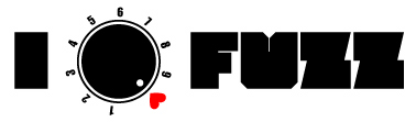
- O.G. Steez
- ILFuzz_stick.jpg (9.66 KiB) Viewed 2405 times
Blacker than bleak, bleaker than black:
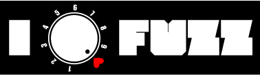
- Black O.G.
- ILFuzzBlack.jpg (10.72 KiB) Viewed 2405 times
BIIIIG heart (personally don't care much for it. Looks too much like standard I <3 ______ shirts):
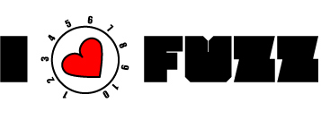
- Big heart
- ILFuzz-Heart.jpg (11.17 KiB) Viewed 2406 times
Bigger heart smaller knob (I think this is a nice compromise):
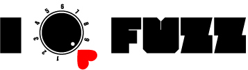
- heart and Knob adjusted
- ILFuzzBgHrt.jpg (9.29 KiB) Viewed 2406 times

- same but black
- ILFuzzBgHrtBlk.jpg (9.22 KiB) Viewed 2405 times
Sooooo yeah...
Re: ILF needs a logo
Posted: Sun Oct 25, 2009 1:58 pm
by Mudfuzz
Dig the last one I do.
Re: ILF needs a logo
Posted: Sun Oct 25, 2009 2:06 pm
by Nychthemeron
Second and last ones. White on Black catches your eye more.

