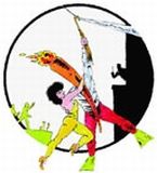
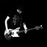
smallsnd/bigsnd wrote:i'll move around the text, but i feel like i tried it centered and it didn't quite work. the "boxiness" issue has been addressed! i erased a bit more of the distressed lines, etc. and it works much better. still not 100% sure on which type of shirts i'll be using... trying for the AA, but they're WAY more expensive.
I prefer it as it is, I think center would look too... central...
smallsnd/bigsnd wrote:i'll move around the text, but i feel like i tried it centered and it didn't quite work. the "boxiness" issue has been addressed! i erased a bit more of the distressed lines, etc. and it works much better. still not 100% sure on which type of shirts i'll be using... trying for the AA, but they're WAY more expensive.
Centered would look to "proper" I think...it's killer off centered as is IMO!
Well it's not that big of a deal. I just tend to think about balance a lot with graphics. It's impossible to say I'd really like it when seeing it centered. Actually the off-center text might work better for me with the improved distress lines. Now they're mostly on the same side as the text which makes unbalanced to my eye.
I think it's cool as is. If you wanted to you could have it at an angle against the circle, or even have it wrap around the circumference of the circle? IDK
smallsnd/bigsnd wrote:i'll move around the text, but i feel like i tried it centered and it didn't quite work. the "boxiness" issue has been addressed! i erased a bit more of the distressed lines, etc. and it works much better. still not 100% sure on which type of shirts i'll be using... trying for the AA, but they're WAY more expensive.
how about adding some distressed lines, reaching even lower past the text >> no more boxiness issue.
:::: Metal up Yöur Jazz! with FUZZIFERblack psychedelic doom ::::
Ugly Nora wrote:It's a sad day when Bassus Sanguinis becomes the voice of reason.
here's a revised version, the one i'm going to use. i don't want to over-think this too much since there's too much other stuff that i'm trying to get out. as well, i don't think all of the little distressed dots and lines are going to print, so they'll probably be slightly different anyways...
i'm going for the tultex poly/cotton blend as well. i checked one out and it feels really nice and soft.
looking good, Brian!
:::: Metal up Yöur Jazz! with FUZZIFERblack psychedelic doom ::::
Ugly Nora wrote:It's a sad day when Bassus Sanguinis becomes the voice of reason.
sorry duders. i am seeing that it takes me about a month to do anything... sigh. anyways, t-shirts were "officially" ordered a few days ago.
i ordered mostly heather grey, heather charcoal and black, but for anyone who commented earlier in this thread about what color/size they wanted - i got you covered!
smallsnd/bigsnd wrote:sorry duders. i am seeing that it takes me about a month to do anything... sigh. anyways, t-shirts were "officially" ordered a few days ago.
i ordered mostly heather grey, heather charcoal and black, but for anyone who commented earlier in this thread about what color/size they wanted - i got you covered!


 how about adding some distressed lines, reaching even lower past the text >> no more boxiness issue.