Page 90 of 127
Re: Let's see your ART!
Posted: Thu Jul 03, 2014 7:11 am
by quarterpound
amazing. the last is holy wtf
Re: Let's see your ART!
Posted: Tue Jul 22, 2014 3:36 pm
by gunslinger_burrito
There's a lot more, but just I finished this guy (Fudo Myoo)

crap lighting....

Re: Let's see your ART!
Posted: Wed Jul 23, 2014 1:57 pm
by ShaolinLambKiller
Very nice!
Re: Let's see your ART!
Posted: Thu Jul 24, 2014 9:31 pm
by dase

newest exhibition piece. I was hoping for ten but I think I'll probably get eight ready. Not bad for three months.
Re: Let's see your ART!
Posted: Thu Jul 24, 2014 10:10 pm
by Iommic Pope
I really dig that.
Re: Let's see your ART!
Posted: Thu Jul 24, 2014 10:46 pm
by ShaolinLambKiller
Looks sweet. dig the line work. I haven't been posting much lately mainly cause I've just been creating it and not posting it cause I'm trying to store up for 3 shows that are pretty much back to back in Sept, Oct, and Nov.
but I did post this:

Re: Let's see your ART!
Posted: Thu Jul 24, 2014 11:53 pm
by tabbycat
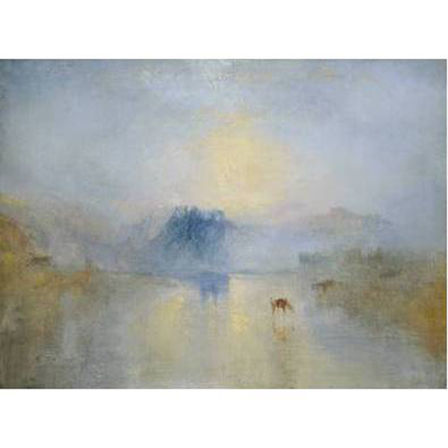
Pugie wrote:

- pugie -Paus på bilsemestern mindre.PNG (242.05 KiB) Viewed 5501 times
hey pugie, i like this. has a real sense of presence. feels like you've managed to balance a japanese-nordic calm and stillness against the starkness of the 1930s german expressionist woodcut style. and your loose treatment of the textures of the landscape in the background contrasts really effectively with the stylised geometric simplicity of the figures and tree. has a strong sense of time and place too. for some reason it reminds me of some of david hockney's 1960s lithos and drawings:
http://www.christies.com/lotfinder/draw ... tails.aspx
if you are up for constructive criticism, i feel unsure about the way you've represented the space (with patches of grass?) between the figures in the foreground and the figure at the tree. they don't seem to reflect the same degree of consideration you have applied to the rest of the image. feel unconvincing and (possibly) too close to comic book conventions of grass. i get the feeling that you may have put them in last, either because you wanted to try to increase a sense of depth there, or felt awkward about leaving a big white space. but i think the relative proportions of the forgound and background figures already resolves the 'creation of a sense of depth' issue for you. leaving a space is nothing to be afraid of. it's the visual equivalent of silence in music. a very powerful tool when you can handle it well.
by way of a couple of random examples...
j.m. turner:
http://andallthatart.files.wordpress.co ... _large.jpg
richard hamilton:
http://stijlmeisje.com/wp-content/uploa ... 912_10.jpg
good luck with you art and keep posting. you have a talent.[/color]
Re: Let's see your ART!
Posted: Sun Jul 27, 2014 11:10 pm
by ShaolinLambKiller

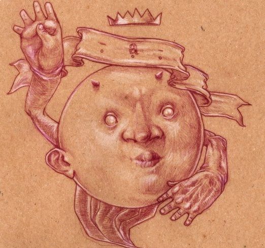
portion of a piece that's going to be a cover for a grindcore comp.
Re: Let's see your ART!
Posted: Mon Jul 28, 2014 7:34 am
by Iommic Pope
Please tell me the comp is called "Stomping your remains into Bourbon Sauce".
Re: Let's see your ART!
Posted: Mon Jul 28, 2014 11:17 pm
by ShaolinLambKiller
hahahah close.. it's called 'STOMPIN GUTS VOL #1'
a goregrind label is putting it out. one of my bands is to submit some songs for it.
Re: Let's see your ART!
Posted: Tue Jul 29, 2014 2:10 am
by Iommic Pope
Nice.
That's a perfect example of funeral shoe right there.
Re: Let's see your ART!
Posted: Tue Jul 29, 2014 12:59 pm
by ShaolinLambKiller
thank ya sir!
Re: Let's see your ART!
Posted: Tue Jul 29, 2014 6:47 pm
by UglyCasanova
A draft-thingy for an album that was never finished
Re: Let's see your ART!
Posted: Wed Jul 30, 2014 3:04 am
by dase
that is extremely sick and/or dope. Love it.

probably the last exhibition one. I'm running out of time and also I feel like setting fire to my desk after spending four months at it every spare moment.
Re: Let's see your ART!
Posted: Wed Jul 30, 2014 5:16 am
by UglyCasanova
Likewise! Love your shadowing style, especially the chest of the person on the left. I wish I had patience for these kinds of dotted illustrations. They always seem to come out looking amazing.