COOLEST LOOKING GEAR
Moderator: Ghost Hip
Re: COOLEST LOOKING GEAR
![]() by echorec » Fri Oct 21, 2016 10:40 am
by echorec » Fri Oct 21, 2016 10:40 am
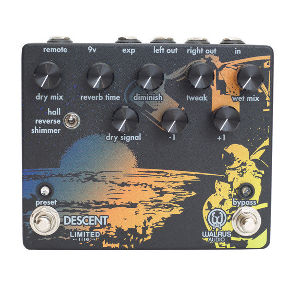
The stock Descent is one of my least favorite pedal designs. It's too busy, and because the text is packed right on top of the illustration, it makes for a very cluttered layout that's unnecessarily difficult to read. This edition of 35, however, fixes those problems.
-
echorec

- IAMILFFAMOUS

- Posts: 4698
- Joined: Sat Nov 01, 2014 1:31 am
Re: COOLEST LOOKING GEAR
![]() by echorec » Fri Oct 21, 2016 10:50 am
by echorec » Fri Oct 21, 2016 10:50 am
Edition of 25, Rickenbacker 360 Noir.

-
echorec
- IAMILFFAMOUS
- Posts: 4698
- Joined: Sat Nov 01, 2014 1:31 am
Re: COOLEST LOOKING GEAR
![]() by echorec » Fri Oct 21, 2016 10:51 am
by echorec » Fri Oct 21, 2016 10:51 am
Yes, there's a bass run in the Noir finish.

-
echorec
- IAMILFFAMOUS
- Posts: 4698
- Joined: Sat Nov 01, 2014 1:31 am
-
D.o.S.

- IAMILFFAMOUS
- Posts: 29819
- Joined: Sun Jul 03, 2011 8:47 am
- Location: Ewe-Kay

Re: COOLEST LOOKING GEAR
![]() by Disarm D'arcy » Fri Oct 21, 2016 11:26 am
by Disarm D'arcy » Fri Oct 21, 2016 11:26 am
echorec wrote:The stock Descent is one of my least favorite pedal designs. It's too busy, and because the text is packed right on top of the illustration, it makes for a very cluttered layout that's unnecessarily difficult to read. This edition of 35, however, fixes those problems.
If I wasn't already owning one, I'd be all over it

Good deals: OsbornKT, Phantasmagorovich, UglyCasanova, DarkAxel, Skip, D.o.S, ColdBrightSunlight, Eivind August, Goroth
https://linktr.ee/disarmdarcy
https://linktr.ee/disarmdarcy
-
Disarm D'arcy

- Supporter

- Posts: 5088
- Joined: Sun Dec 04, 2011 5:04 pm
- Location: France
Re: COOLEST LOOKING GEAR
![]() by echorec » Fri Oct 21, 2016 2:03 pm
by echorec » Fri Oct 21, 2016 2:03 pm
This was in the wrong thread earlier. 

-
echorec
- IAMILFFAMOUS
- Posts: 4698
- Joined: Sat Nov 01, 2014 1:31 am
Re: COOLEST LOOKING GEAR
![]() by Disarm D'arcy » Fri Oct 21, 2016 2:04 pm
by Disarm D'arcy » Fri Oct 21, 2016 2:04 pm
Naaaaaahh. Bursts are ugly as fuck. That is a fact.
Good deals: OsbornKT, Phantasmagorovich, UglyCasanova, DarkAxel, Skip, D.o.S, ColdBrightSunlight, Eivind August, Goroth
https://linktr.ee/disarmdarcy
https://linktr.ee/disarmdarcy
-
Disarm D'arcy
- Supporter
- Posts: 5088
- Joined: Sun Dec 04, 2011 5:04 pm
- Location: France
Re: COOLEST LOOKING GEAR
![]() by jrfox92 » Fri Oct 21, 2016 2:17 pm
by jrfox92 » Fri Oct 21, 2016 2:17 pm
echorec wrote:Edition of 25, Rickenbacker 360 Noir.
Pure sex.

Since I always forget:
SPOILER : show


Inconuucl wrote:You can't kill Strymon, it'll just resurrect 3 days later.
BitchPudding wrote:Despite all my rage, I am still just eating tacos in a cage.
Inconuucl wrote:Welcome to ilf, we have three jokes and twelve posters. <3
-
jrfox92

- IAMILFFAMOUS
- Posts: 4674
- Joined: Sun Jun 22, 2014 11:23 am
- Location: Akron, Ohio
Re: COOLEST LOOKING GEAR
![]() by repoman » Fri Oct 21, 2016 4:40 pm
by repoman » Fri Oct 21, 2016 4:40 pm
echorec wrote:Edition of 25, Rickenbacker 360 Noir.
dear lord
F U T U R E G A M E R
-
repoman

- IAMILF

- Posts: 2291
- Joined: Sat Sep 26, 2015 3:16 pm
- Location: Edge City
Re: COOLEST LOOKING GEAR
![]() by Iommic Pope » Fri Oct 21, 2016 5:59 pm
by Iommic Pope » Fri Oct 21, 2016 5:59 pm
jrfox92 wrote:echorec wrote:Edition of 25, Rickenbacker 360 Noir.
Pure sex.
Fuck yes.
WWPD?
fcknoise wrote:You are all fucking tryhard effort posting nerds
Invisible Man wrote:I'm probably the most humble person I know. I feel good about smelling my own butthole.
Jesus Was a Robot wrote:Did you just assume Billy Corgan's dildo preference??
-
Iommic Pope

- IAMILFFAMOUS
- Posts: 11405
- Joined: Tue Mar 05, 2013 8:41 pm
- Location: Frimmin' on the Fram
Re: COOLEST LOOKING GEAR
![]() by Chankgeez » Fri Oct 21, 2016 6:02 pm
by Chankgeez » Fri Oct 21, 2016 6:02 pm
Iommic Pope wrote:jrfox92 wrote:echorec wrote:Edition of 25, Rickenbacker 360 Noir.
Pure sex.
Fuck yes.
I've got a Sharpie and a little bottle of Wite-Out. I'm gonna do this to all my guitars.

…...........................…psychic vampire. wrote:The important take away from this thread: Taoism and Ring Modulators go together?
Sweet dealin's: here
"Now, of course, Strega is not a Minimoog… and I am not Sun Ra" - dude from MAKENOISE
#GreenRinger
-
Chankgeez

- IAMILFFAMOUS
- Posts: 41888
- Joined: Tue Oct 11, 2011 1:40 am
- Location: https://www.youtube.com/watch?v=FGhbeHujNZQ youtube.com/watch?v=V-2l7kkBURc

Re: COOLEST LOOKING GEAR
![]() by oscillateur » Sat Oct 22, 2016 1:40 am
by oscillateur » Sat Oct 22, 2016 1:40 am
The Rickenbackers somehow look like Batman's guitars even more than a black SG...
-
oscillateur

- IAMILF
- Posts: 2014
- Joined: Sun Oct 02, 2011 6:16 am
- Location: Tokyo
Re: COOLEST LOOKING GEAR
![]() by Cisco » Sat Oct 22, 2016 4:26 am
by Cisco » Sat Oct 22, 2016 4:26 am
echorec wrote:Edition of 25, Rickenbacker 360 Noir.
Like this?

-
Cisco

- committed

- Posts: 398
- Joined: Mon Feb 16, 2015 6:16 pm
- Location: Dago
Who is online
Users browsing this forum: Bing [Bot] and 14 guests
Sponsored Ad. (Please no inflated/repetitive clicking. Thanks!) 
|